Disneyland
More Than a Font
Reading Time: 4.2 Minutes
Disneyland
More Than a Font
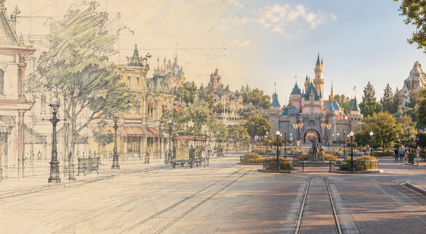
Before most people ever walked beneath the Disneyland Railroad or saw Sleeping Beauty Castle in person, they had already seen Disneyland. They had seen it in nine letters.
The original Disneyland lettering has always felt like more than a logo to me. The tall, narrow forms, sharp serifs, unusual curves and the way each letter feels drawn rather than simply typed give the word a personality before you even begin to read it. It feels old without feeling dated, formal without feeling stiff, and imaginative without becoming childish. Somehow, all of those qualities exist inside a single word.
That is what makes it such a great example of typography as design.
Drawn, Not Chosen
We often refer to the Disneyland lettering as a font, but I think it is more interesting to look at it as a piece of lettering. It was part of the visual identity of Disneyland before the park even opened, appearing as Walt introduced the idea of Disneyland to television audiences in 1954. And when you look closely at those letters, you begin to realize how much is happening.
Some strokes are heavy while others become incredibly thin. The serifs come to small, delicate points. The letters rise and fall at different heights. Certain forms feel almost medieval, while others are surprisingly elegant. Even individual lowercase letters have enough character that they could almost stand on their own as small illustrations.
Most importantly, the word has a shape. If you blurred the lettering enough that you could no longer read it, I think many Disney fans would still recognize its silhouette. At that point, typography is doing more than giving us information. It has become an image.
The Shape of the Story
Typography is one of those things we as designers can sometimes treat as something that comes later. We establish the layout, choose the colors, place the photography and create the shapes surrounding the content. Eventually we arrive at the words and ask, “What font should go here?”
But type should never simply fill the space left behind. Letters are shapes too. They create rhythm, contrast and negative space. A line of type has weight, movement and proportion in exactly the same way an illustration, photograph or architectural detail does. The words carry the message, but the way those words are drawn can tell us how that message is supposed to feel. The Disneyland lettering does that beautifully.
Nothing about it feels accidental. The tall vertical strokes give the word importance. The pointed details bring in just enough fantasy. The older influences give it a sense of history. The slight irregularity keeps it from feeling mechanical or overly polished.
Before the word tells us where we are going, its shape has already started telling the story.
Somehow, It Belongs Everywhere
I think there is another reason this lettering has lasted so well. Disneyland itself does not belong to one visual period.
Walk through the entrance and you can find yourself in an idealized American town from another century. A few minutes later there is a medieval castle in front of you. Beyond that are jungles, rivers, frontier towns, futuristic landscapes and places that never existed outside someone’s imagination.
The lettering could have easily followed the graphic trends of the 1950s when Disneyland was created. If it had, it might now feel like a beautiful artifact from a very specific point in time. Instead, it seems to reach much farther back.
There are hints of historic and Gothic letterforms, but they have been simplified and reshaped into something of their own. Because of that, the word Disneyland does not feel completely connected to one decade, one place or one architectural style. It simply feels like Disneyland.
That may be why those letters can sit alongside a Victorian train station, a castle, a piece of hand-painted signage or something completely modern and still feel at home.
Over time, the lettering created its own visual language.
More Than a Font
As a designer, this is the part I keep coming back to. It is easy to think of typography as the vehicle carrying our words. Choose something readable, establish a hierarchy and move on to the more visual parts of the design. But typography is one of the visual parts. Sometimes it may be the most important one.
The Disneyland wordmark does not need an icon beside it to explain what it represents. It does not need a castle above it or mouse ears attached to it. The lettering itself has become recognizable because its shapes have carried the personality of Disneyland for generations.
Those nine letters have become part of the architecture of the place. And maybe that is the detail worth noticing. Good typography tells us what something says. Great typography helps tell us what something feels like.
More than seventy years after people first saw the name Disneyland on their television screens, those letters are still doing exactly that.